
Tortoiseshell Fur
Step-by-Step
Drawing Complex Fur with Confidence
beautiful and complex
Tortoiseshell (or "tortie") fur presents unique challenges for coloured pencil artists:
This step-by-step guide reveals how to capture those elusive golden flecks nestled within darker fur.

-
01.
Complex, Random Patterning
Unlike tabby stripes or calico blocks, tortie patterns appear completely random with no predictable structure. The intermingling of black, orange, and cream tones creates intricate patterns that shift and flow across the cat's body.
-
02.
Temperature Contrasts
The contrast between cool (black) and warm (orange) tones requires careful colour management to capture the natural temperature shifts in the fur.
-
03.
Brindling & Transitions
Fine golden/orange hairs embedded within darker areas create a distinctive flecked appearance that's difficult to capture.
Beyond Black and Orange
-

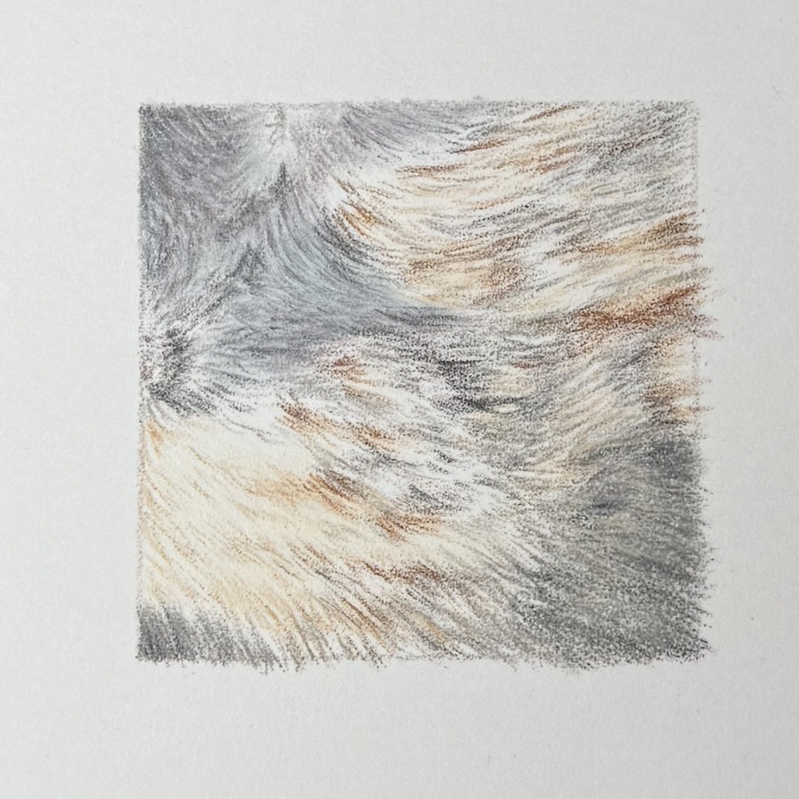
Reference Photo
This reference photo reveals the complexity of tortie patterns - the random distribution of golden flecks, varying densities, and subtle colour temperature shifts in the ‘black’ fur. Study how light affects different areas of the fur and how colours transition between sections.
Reference photo by Herman Delgado, Unsplash
I suggest working in a bounding box roughly 6 cm by 6 cm.
-
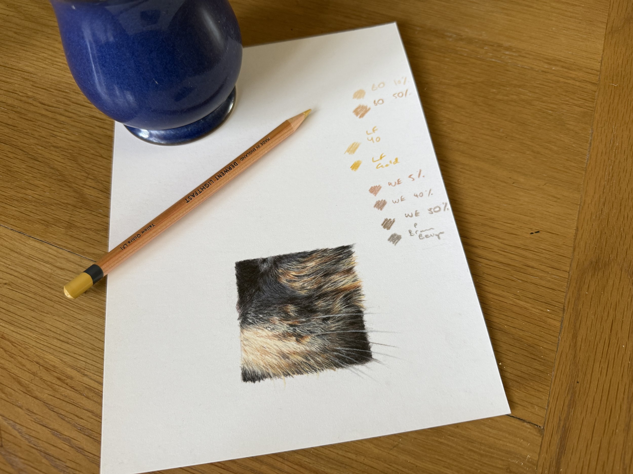
Materials and Colour Guide
Surface: White Pastelmat
Note: As this approach doesn't rely heavily on light-over-dark techniques, most of these colours and methods will transfer well to other surfaces such as hot press watercolour paper or Bristol Vellum.
I've grouped pencils by purpose to help you understand their role in creating realistic tortie fur. While my exact brand selections are listed, focus on the colour relationships rather than specific pencils. The principles transfer across brands and can be adapted to your collection.

Observations from Our Ref Photo
In addition to the usual fur direction patterns across the face, we can see:
Golden flecks appear randomly distributed throughout the black areas, with varying density
We might also see subtle variation in the ‘black’ fur.
Blue-leaning blacks in areas facing upward (reflecting sky light?)
Red/purple-leaning blacks in areas illuminated from below
-
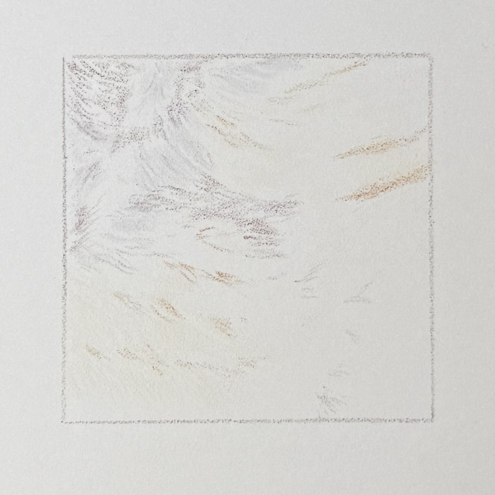
Step 1
Apply an initial sketch with light directional strokes - no formal line art needed. Use Ivory and Burnt Ochre for lighter/orange-leaning areas, and Sepia 10% as a neutral for transition areas. Mark key anatomical features like whisker follicles and areas along the cheekbone where golden tones will appear.

-
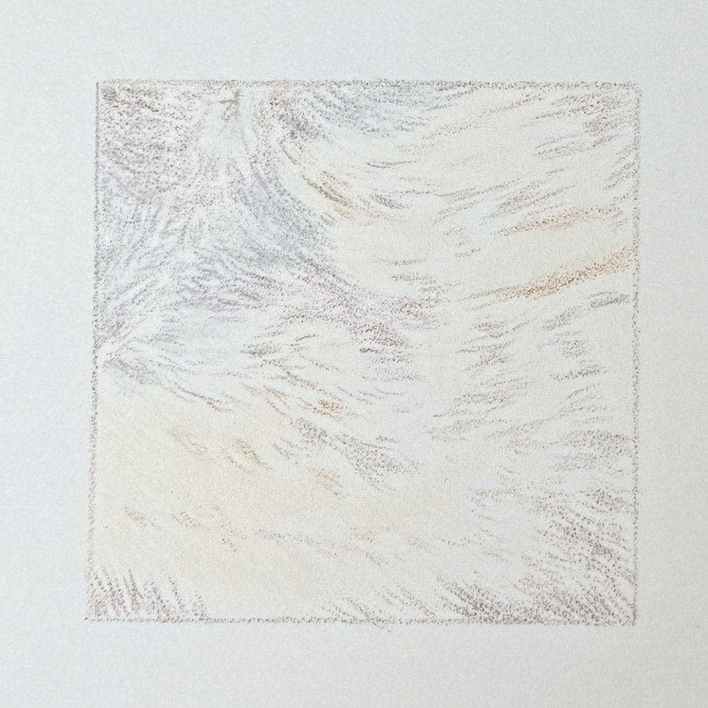
Step 2
Continue light mapping of different colour zones. Use Caput Mortuum Violet for areas illuminated from below with warmer light, and Silver Grey (or Cold Grey II) for cooler areas. Maintain very light pressure and follow the fur direction.
-
Step 3
Apply Cold Grey III in all main black areas using light pressure and following fur direction. Use Sepia 10% as an underlayer where black meets orange. At this stage, we're refining our mental map of the fur patterns for reference later. Add more Caput Mortuum Violet in the chin/neck area, flicking in from the main dark areas into the paler fur.
-
Step 4
Add Silver Grey over black fur reflecting light from above. Apply another layer of Cold Grey III over most black areas, including the neck and chin. Begin adding Payne's Grey for initial shadows - think about drawing the depths or spaces between fur strands rather than the fur itself. Maintain light pressure throughout.

-
Step 5
Apply Caput Mortuum Violet in main black areas, using rounder sketchy strokes on the bridge of the nose (where fur is shorter) and directional strokes elsewhere. Add Brown Ochre with light pressure as a glaze in patches of palest fur on the muzzle, and medium pressure in the flecked areas on the cheekbone. Continue building shadows with Payne's Grey, including non-directional rounded strokes on the nose. Blend and smooth black areas with another light layer of Cold Grey III.

-
Step 6
Use Brown Ochre 10% around the whisker pad, aligned with fur direction but against growth direction, to create depth in the pale fur. Keep application loose and sketchy with uneven coverage, leaving some Ivory showing. Add flecks of Charcoal Grey into orange/pale fur areas with super light pressure, extending to the neck and chin areas.

-
Step 7
Apply Silver Grey across main black areas to smooth and subtly push back the Payne's Grey (we'll rebuild intensity later). Use Warm Grey III to flick into pale fur under the chin with tapered strokes, and in the neck area using small circular motions for an out-of-focus effect. Extend directional strokes into the cheekbone area. Add flecks of Brown Ochre 10% on top, embracing the "mucky" brown that results. Apply Burnt Sienna in the richer brown areas of the pale fur.
-
Step 8
Apply Dark Sepia with very light pressure in the neck area, central region, and lightly into pale fur on the whisker pad. Darken black areas with Payne's Grey. Use Sepia 10% in transition zones where pale fur meets dark, starting under the whisker pad (to build confidence) before working into more challenging areas. Maintain plenty of untouched ivory and pale Brown Ochre.

-
Step 9
Alternate Warm Grey III and Dark Sepia in warmer areas, and continue with Payne's Grey in black regions. Maintain light pressure and directional strokes throughout (except on the nose). Add depth to whisker follicles with Burnt Ochre. Introduce Black selectively in the darkest shadows, being careful to follow fur direction.

-
Step 10
Glaze Caput Mortuum Violet over blacks illuminated from below and Cold Grey III over other black areas. Add another layer of Dark Sepia in the neck area and flecked cheekbone region, flicking into paler fur. Darken some pale fur lightly with Brown Ochre to build richness. Place selective Black flecks in the darkest areas to maintain fur texture.

-
Step 11
Darken blacks with Pablo Black. Add Pablo Cocoa in the neck area, flicking into paler fur and around the whisker follicles. Apply sharp, confident strokes of Brown Ochre in the cheekbone area, noting how it creates vibrant colour when applied over Ivory. Use Ivory pencil to cover any remaining untouched paper.

-
Step 12
With a very sharp Pablo Cream, add flecks of pale fur into darker areas. Include some stray hairs that cross the main fur flow direction. At the roots of pale fur, flick over some Sepia 10% to soften transitions. Optionally, add vibrant pops to orange tones with Lightfast Mars Orange and Yellow Ochre. Add slivers of sharp black between the lightest fur at the top of the whisker pad, focusing on darkening fur that appears "behind and underneath."
-
Step 13
Add delicate details with sharp Charcoal Grey, looking for shapes behind and between paler fur. Weave shadows into the flecked fur on the cheekbone and whisker pad using varied strokes. Apply Cold Grey III for smoothing if needed. Glaze Burnt Sienna into transitions and follicles. Use Museum Aquarelle Warm Earth 50% or Pablo Brownish Beige to moderate areas where colour becomes too intense.

-
Step 14
Add depth to the whisker pad with Brown Ochre 10% and Pablo Brownish Beige. Add further flicks of palest fur with sharp Pablo Cream if desired. Create whiskers with sharp Pablo Silver Grey or White, starting from the whisker pad and sweeping outward with confidence. Focus on natural flow rather than exact replication of the reference.

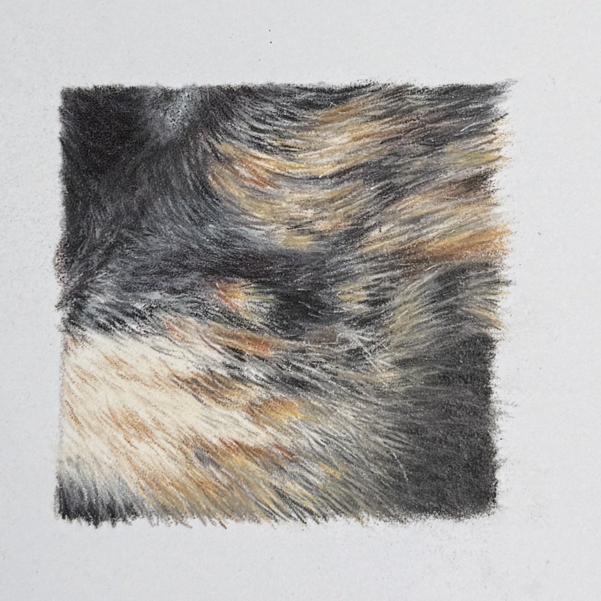
Step 15 - Optional Refinements
Glaze Delft Blue followed by Pablo Steel Grey over cool black areas. Add Pablo White highlights to whiskers for greater definition. Place subtle flecks of Museum Aquarelle Naples Ochre within black fur to create unexpected warm accents.
And take a step back.

The Tortie Blueprint: Techniques to Keep in Your Arsenal
Final Thoughts
My approach to tortie fur revealed several techniques I'll continue to use:
Split black fur by temperature: Separate blue-leaning and purple/red-leaning areas based on lighting conditions
Maintain colour separation: Keep cool fur tones away from pale and orange fur to preserve vibrancy
Use violet greys in transitions: These create more natural blending between different coloured areas
Build pale fur strategically: Layer Ivory, Burnt Ochre 10%, Brownish Beige, Burnt Sienna, and Lightfast Yellow Ochre
Add light flecks with sharp pencils: Pablo Cream and Museum Aquarelle Naples Ochre create distinctive pale highlights
Use varied greys for brindled areas: Charcoal Grey and Sepia 10% create dimensional effects in mottled regions
This approach helped me overcome the most challenging aspects of tortie fur - maintaining the vibrant golden tones while creating the distinctive brindled effect where colours intermingle. The result captures that characteristic tortie complexity that makes these cats so visually fascinating.