
Bluebells and the Value of Quick Studies
When we encounter a new subject we want to draw, where do our thoughts first turn? For many of us, it's to technical considerations: What pencils should I use? Which surface works best? How will I approach this? But during my recent bluebell obsession, I began wondering if we sometimes skip past an equally important question: why are we drawn to this subject in the first place?
In this post, I'll walk you through my process of exploring a new subject and explaining why I'm now weaving thumbnail sketches and colour swatches into my preparation process for all my coloured pencil artworks.
This taster approach gives me a greater understanding of composition, form, value and colour. And, here, saved me hours and hours on a drawing I wasn't really enjoying nor connecting with.
First Encounter: Observation and Composition
Before diving in, I take time to truly observe what I'm drawing.


Looking at my reference photo, I noted several important characteristics:
The distinctive "droop" of native English bluebells (unlike the more upright Spanish bluebells that are invasive in many woodland areas)
The delicate bell-shaped flowers that curl at the edges, almost like little scrolls
The way light plays through the semi-transparent petals
The relationship between the green stem and the blue-violet flowers
I'm an advocate for a mini study (or studies) next. Little sketches that capture the essence of the subject - in terms of value or texture, form or colour. Low pressure technical experiments that can also reveal whether I want to pursue a full drawing.
This means that when approaching a new subject, I actually make two distinct cropping decisions:
Final Composition Crop: What I'd include if creating a full, detailed piece
Study Crop: What specific area or element I need to test in my mini-studies
This distinction is important - sometimes the perfect crop for a finished piece isn't the most useful area to focus on for technique exploration.
To make life easier, I keep templates, made from old mount board, ready to go: 6×6 cm square or ATC size (2.5×3.5 inches). Having these in arms reach means I can quickly start a new sketch without the faff of deciding on sizes or measuring and cutting paper.
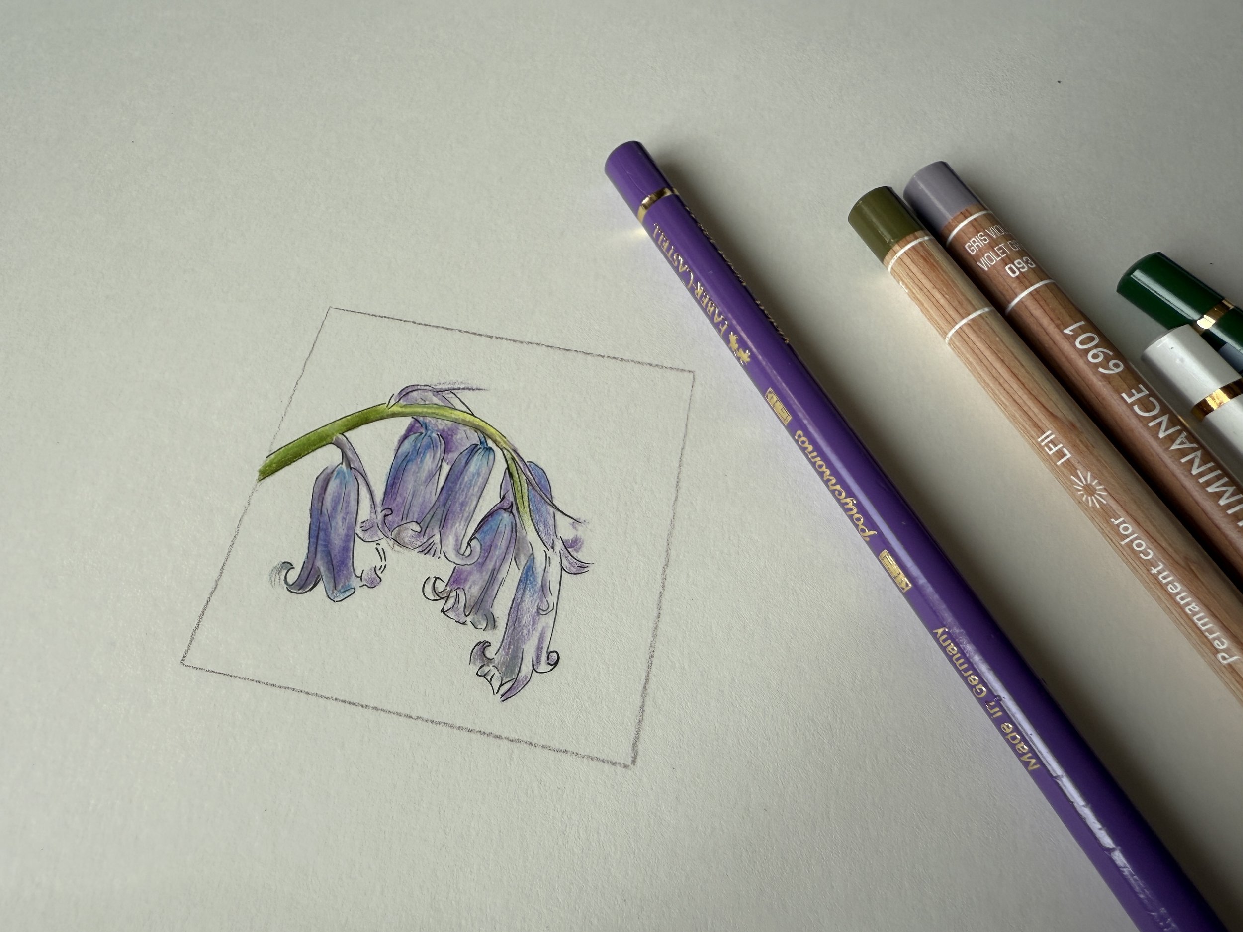
For this bluebell study, I chose to focus on a single stem to showcase that characteristic curve. Even for these quick studies, I prefer to do a full sketch rather than simple swatches; I want to know how the colours interact when actually drawing, not just side by side.
My initial thoughts about a drawing approach (before pencil hits paper):
The flowers would require gentle gradations in colour. It would be easy to go too dark or make the palest areas look "mucky"
I'd need a clean but pale colour base - an underlying luminosity for the delicate petals
I knew that, arguably, the best way to define the edges of the flowers would be to draw the background but I didn't want to.
Colour Exploration
Based on my observations, I developed a strategy for my colour palette. I would likely need:
Cool white or off-white for the palest areas - both as an underlayer and as a penultimate smoothing layer
Bright and vibrant blue paired with violet. I wasn't concerned about the value of these - I'd adjust with white/paler colours or pressure
A few greens, specifically yellow-leaning ones. At least one bright green and one "mucky" (brown-leaning/ olive) green
A blue-grey and / or violet-grey for cast shadows
I grabbed a range of colours likely to work based on these colour groupings and descriptions, planning to refine my selection as I worked.
First Approach: Hot Press Paper
My approach was to freehand blocks of colour. I didn't want a harsh outline ("lost edges are needed," I kept repeating to myself). I started with the stem to get a feel for the paper. Bright yellow, then green, darker green, back to yellow to highlight blend.
I then applied a bright off-white as a base layer/barrier for the flowers. I've used this approach before for highlights/luminosity in eyes. It stops darker pigment dropping into the tooth, which is harder to remove or adjust. The downside: for a good few minutes it can feel like you're drawing blind, not really seeing where the pigment is going.
I swapped to midtones - super light washes of violet. I found myself stroking down the petals, flicking up at the edges. I smoothed with white or off-white, adding a little blue where the stem meets the flower, then dragging the pigment down just a little with white. There was a dance back and forth as I built up the values, tweaking details with the greys.


When I tried a few colours that weren't quite right, I dabbed them out with a kneadable eraser. Making little notes of the ones that worked well, I also took a photo of the pencils for future reference. All this took about half an hour.
The specific pencils I selected were:
Faber-Castell Polychromos: Light Yellow Glaze, Permanent Green, Helioblue Reddish, Violet, Pink Madder Lake
Caran d'Ache Pablo: Light Olive, White
Caran d'Ache Luminance: Olive Brown, Violet Grey, Steel Grey
Caran d’Ache Museum Aquarelle (used dry): Light Cobalt Blue, Manganese Violet
Derwent Lightfast: Oyster
The test told me two things: what colours worked well, and... I didn't enjoy the process.
Second Approach: Line Work
I found another half hour and swapped to a fineliner pen with a fine nib. Another 6×6 cm square. Same reference. Same crop.
I concentrated on form, getting a feel for the flow of the petals and how the flowers relate to each other. I enjoyed it immensely. It was super quick. But while the individual strokes of the pen were delicate, something had been lost. A lightness, perhaps. The flowers felt incomplete without their colour.

Bluebell sketches
Top: fineliner on hot press
Bottom: coloured pencil on hot press
Third Approach: Pastelmat
A new day, another short session. Back to coloured pencils, but this time on a different surface - one of my favourites, Pastelmat. Perhaps I wasn’t connecting to the bluebells because i’m not a great fan of hot press.
I used the same colours as before but approached the subject as new. How would I draw on this more textured surface? Answer: exactly the same in terms of the order and laydown of pencils and strokes - if anything, I simply went slower and used more gentle layering. I enjoyed this process immensely, finding that reassuring "pull" on the pencils - a slight abrasiveness - that I enjoy when working with Pastelmat.
While I enjoyed the process, I still didn’t feel that I could define the flowers properly, without outlining them. This wasn’t the surface I wanted to use for a bigger piece.
Fourth Approach: Mixed Media
Inspiration hit while out and about. What if I combined approaches? I started with the fineliner for structure and form, then added coloured pencil, using the same colours and approach as before.
The result was technically my best yet, and the most enjoyable process yet.
Want to see this approach in action? I've recorded a 30-minute process video showing exactly how I created this mixed media bluebell sketch (with a limited palette). Watch the video here.
While I’ve drawn these flowers twice - a second time to share as a demonstration - something felt off - like I was colouring in. My love of sketching battling with my desire for realism. It didn't feel authentic to me, despite the objectively pleasing result.
Finding My Connection: The Woodland Scene
After several explorations, above, focusing on the technical aspects, I had my revelation. What I loved about bluebells wasn't the individual flowers but the experience of walking through bluebell woods with my family.
This shifted my approach entirely. I selected a reference photo with no thought to technical difficulty—one I simply loved: my daughter in the distance, at the end of a winding path through banks of bluebells.
I chose a cotton surface - Strathmore Bristol Vellum 500, another favourite. I brought in more colours, prioritising composition and then blocks of colour - cool here, warm there. I exaggerated from the reference photo. I loved it. I got lost in the process. I played with pressure. I scribbled. This felt right.
Will I do a 'proper' drawing from this exercise? Maybe. I don't have time at the moment. It would be a fantastic technical challenge...

Quick landscape
Coloured pencil on Strathmore Bristol Vellum 500
What I Learned: The Value of Abandoned Work
One of the most valuable lessons from this process was learning to appreciate the worth of half-finished pieces and abandoned works. Each sketch taught me something important, even when (perhaps especially when) I decided not to continue.
Sometimes it's okay to step away if you've learned what you needed to know. Not every sketch needs to become a finished piece. These ‘failures’ aren't failures at all—they're research, exploration, and necessary steps toward finding what truly resonates.
The half-hour I spent on each approach saved me countless hours I might have invested in a full-sized piece that ultimately wouldn't have brought me joy. More importantly, they led me to discover what actually did excite me about the subject.
Building This Into My Process
The habit of creating quick sketches or mini studies is relatively new to my practice, but it's already making a dramatic difference. For a long time, I viewed such exercises as procrastination - delaying the ‘real work’ of creating a finished piece or perhaps screaming a lack of confidence. But what surprised me most about this bluebell exploration, completed in snatched moments over just a few days, was realising I didn't actually want to draw what I initially thought I did.
Despite creating five different bluebell studies (indicating I had some genuine interest in the subject) I hadn't felt that spark of excitement with any of them. Until, that is, I shifted my perspective entirely and sketched the woodland landscape with distant bluebells.
What I've learned to appreciate is how these small studies serve multiple purposes:
Technical exploration: Testing surfaces, colour combinations, and approaches without the pressure of a larger commitment
Time efficiency: Revealing in 30 minutes what might have taken hours to discover in a full piece
Emotional connection: Helping me understand which aspects of a subject truly inspire me
Permission to pivot: Giving myself the freedom to change direction when something isn't working
Perhaps most importantly, I've learned to see these ‘abandoned’ studies not as failures or time wasters but as valuable research. Each sketch taught me something.
So while I might not frame any of these bluebell close-ups, the time spent creating them wasn't wasted. They led me to a deeper understanding of what aspects of nature truly inspire me, and they saved me from investing hours in a detailed piece that wouldn't have brought me joy.
Have quick studies helped you discover unexpected insights about your artistic preferences? I'd love to hear your experiences.