
Unicorn Colours and My Journey Splitting the Colour Wheel
Introduction
I didn't go to art college but I feel I've always been familiar with the concept of primary and secondary colours and the colour wheel. I purchased a little cardboard one (12 colours) when I returned to art a few years ago. I've not used it much. I felt like it was trying to be everything to everyone - too much on it - and I didn't have time for that. Let me at my pencils! :)
Complementary colours were one element where I thought there was practical value. Red next to green makes your colours pop in a landscape. Ooh yes. Red mixed with green should make a neutral. Erm… Okay. The latter rarely works though does it? And how often do we use vivid colours? What if I've got red-brown dog fur? What green do I use?
Some time later, I discovered there are many different colour wheels. On the one hand - oooh that's interesting. On the other - ugh. More confusion. I do enjoy learning but I don't have much time so practical understanding is what I seek. More recently, I stumbled across the split primary colour wheel and I found something of real value there. I went down a rabbit hole and started filling my notebook, sketchpad and scraps of paper with little tests.
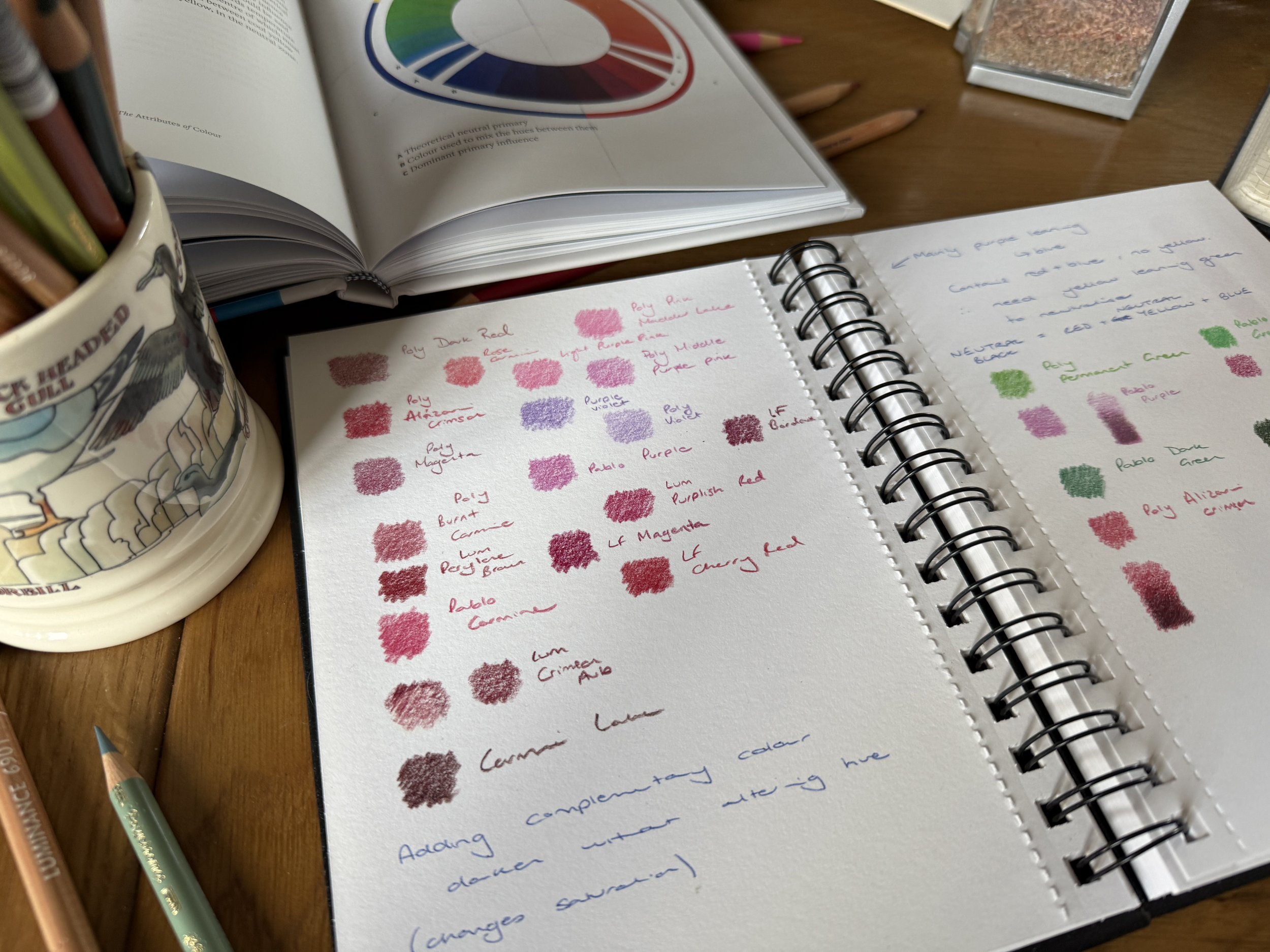
In a nutshell, you need to accept that neutral red, blue and yellow primaries are unicorn colours; most reds, blues and yellows lean to either orange, purple or green. They have a bias. If you can spot the bias, you'll find tweaking your colours much easier.
My Split Primary Experiment
I'll accept that colour theory is really useful for artists who paint. You take a little of one, mix a little of another colour. Add a little more. Oops too much. Add a little of the first. Dance around. Could I use a similar approach with my pencils?
I limited myself to one brand for simplicity - Faber Castell Polychromos - and chose three sets of primary pairs of similar intensity (that took a bit of trial and error).

My Pencils were:
Yellow with Green Bias: Light Yellow Glaze (cooler, leans toward green)
Yellow with Orange Bias: Light Chrome Yellow (warmer, leans toward orange)
Red with Orange Bias: Scarlet Red (warmer, leans toward orange)
Red with Purple Bias: Alizarin Crimson (cooler, leans toward purple)
Blue with Green Bias: Phthalo Blue (leans toward green)
Blue with Purple Bias: Ultramarine (leans toward purple/violet)
To be honest, I'm surprised just how well it worked - I was able to 'mix' secondary colours through gentle layering. For example, when I overlaid pencils with similar biases (like my Ultramarine with Alizarin Crimson), I created vibrant purple. But when I mixed orange-leaning reds with my blues, I got those muddy browns we've all experienced.
What surprised me most was how effective light layering was for creating new colours. By using consistent, gentle pressure and building up layers gradually, the optical blending created results closer to paint mixing than I expected - especially when I added a touch of white as a middle layer to blend, then repeating the process.
That's all very well but, to be fair, if I want a purple, I'll reach for an off-the-shelf purple. Let's skip to the practical applications.
Identifying Pencil Positions on the Colour Wheel
How do you apply this to your existing collection? Start by looking at your pencils with fresh eyes. That "Magenta" and "Crimson" in your set might both be labeled as reds, but one likely leans purple and the other orange. You might have already spotted these variations, perhaps describing them as cool or warm variants. Trying to spot that bias, or thinking in terms of the influence of blue or yellow, is much more useful, however.
If you are so inclined, spend some time with your pencil collection and ask yourself some simple questions:
Does this yellow lean more toward green or orange?
Does this red lean more toward orange or purple?
Does this blue lean more toward green or purple?
You could create a simple bias map for your own collection. You don't need anything fancy - just group similar colours and note which way they lean. You'll start seeing patterns that make colour selection much more intuitive. Here’s one I used for a calm water piece:

Swatching blues
I grabbed a range of blues and tested them rapidly (far left). I then started arranging them into categories in the middle - some leant towards green. I picked a few green-blue pencils for the final project (far right).
This mapping has practical benefits:
You'll be able to more easily substitute across brands when one pencil runs low
You'll be able to predict which pencils will blend harmoniously together, or sit nicely side-by-side
You'll be able to identify strategic gaps in your collection (do you really need another cool green pencil or can you just add a bit more green-blue to what you have?)
And perhaps most useful of all - you'll be able to tweak colours with more precision
But first, a little caveat…
How Coloured Pencil 'Mixing' Differs from Paint
Unlike paint where pigments physically combine, coloured pencil mixing is largely an optical illusion. We're creating the appearance of a new colour through several distinct methods:
Optical Blending
When we layer pencils with light pressure, the eye combines the colours visually. The colours don't actually mix - we're layering dry layers of pigment beside and on top of each other, creating the illusion of a new colour. And we don't do this on a palette - we 'mix' on paper. This means we need to be especially mindful of which colours we're combining.
Physical Mixing Techniques
For those times when we want colours to truly blend:
Burnishing: Using heavy pressure with a lighter pencil (or colourless blender) to physically push colours together
Solvent blending: Painting on a solvent or a blender pen to temporarily dissolve the binder and allow colours to mix
Underpainting/grisaille: Creating a foundation with one colour that influences everything layered above it
Understanding these different approaches gives you more control. I'll often use gentle layering for most of the piece (optical blending), then use a slight burnishing in middle layers with a glaze of colour on top. Sometimes I 'map' in my colours first in a sort of underpainting - but I rarely do this with consistency over the whole piece.
Value Changes
We also have three primary approaches to changing value in coloured pencil work:
Traditional methods: Adding layers or varying pressure; adding white or black
Analogous method: Adding adjacent colours on the wheel to shift both hue and value
Complementary method: Adding a touch of the colour's complement to reduce saturation while maintaining hue
Each approach creates distinctly different results. Adding white or grey is straightforward but can flatten the vibrancy. The analogous method maintains character but shifts the hue. The complementary method preserves the hue while reducing saturation - perfect for subtle shadow work.
My Pink Jumper Experiment
We all see colour differently. Early in my coloured pencil journey I realised that I found vibrant oranges and cool reds and pinks more challenging than some other colours to work with and blend.
A few weeks ago, I tackled the former with my ginger fur focus (see blog here).
This week: pink.
I did some swatching. I played with adjusting the values with white, some analogous colours and a few complementary colours. It was all a bit theoretical and… boring.


So, I downed tools (hurrah!) and set out on a walk with my kids to find some red or pink flowers. My kids (6 and 9) did not really feel like going on a nature walk (eldest: "but we always go for like 5 kilometres or something, my legs hurt..!" and the youngest: "can we have a snack?"). So… in the name of getting out of the house anyway, and hoping to spot some blossom on the way, we compromised on the playground. And… I took photos of my daughter's pink cardigan.


Back at home - the photos revealed some lovely variations in both hue and value. I could see almost neutral vibrant reds, purple-leaning reds (what I would call cool dark reds) and some purples. I am a genius. What a good idea! Erm, no. I learnt a lot over the next few hours (while throwing snacks out to the kids in the garden). Mainly: that a close up of this textured fabric was a flipping nightmare for testing my patience…
I also learned:
What appears as a single "pink" garment revealed itself as a complex interplay of red-purple in direct sunlight and deeper violet in the shadows
Understanding the light source direction (cool blue light from lower right, warm sunlight from upper left) was essential for accurately representing the colour variations
Adding green (the complement to red) to deepen shadows works brilliantly - but only when you match the specific green to the specific red bias you're working with
Swatching reds, pinks and purples
(and testing green complements)
And for this subject:
Fabric such as this required prioritising pattern over detail - I spent too much time on individual clumps of threads rather than the overall fabric structure
A battery-powered eraser was surprisingly effective for creating highlights on this surface (Strathmore Bristol Vellum 400)
You can nearly always get wispy details at the end with a sharp Pablo White.


Strategic Colour Correction
One of my all-time essential pencils has been Luminance Violet Grey. I use it constantly to dull or calm down orange fur, to add shadows and in transition zones between warm and cool fur (or warm and cool autumn leaves). I find it incredibly versatile, reaching for it across many different projects. But until recently, I didn't fully understand why it worked so well in so many situations.
When I began exploring colour bias, everything clicked into place. Most orange pigments contain a significant yellow bias. Violet, being directly opposite yellow on the colour wheel, specifically neutralises that yellow component without affecting the fundamental orange hue. This creates a more natural, subdued orange without the muddiness that comes from adding brown (or boldness of adding a blue complement!)
What makes Violet Grey particularly effective is its subtlety. It's not a strong purple that would dramatically counteract the yellow, but a gentle neutraliser that can be built up gradually. This allows for precise control over how much of that yellow bias you want to tame.
In transition zones between warm and cool areas, Violet Grey works beautifully because it bridges the gap between temperature extremes. When moving from yellow-biased warm areas to blue-biased cool areas, the violet component shares characteristics with blue while specifically counteracting the yellow. This creates a smoother, more natural transition than simply blending the two areas directly, which often results in muddy greens where they meet.
The principles behind this "fixer pencil" approach extend beyond Violet Grey. I've started experimenting with pale green pencils to make similar targeted adjustments to red-based colours. In my swatch tests (pictured below), you can see how different greens subtly adjust and neutralise pinks.

pink + green
A few experiments to mute and transition pinks using pale greens.
Understanding the "why" behind these colour relationships has transformed my approach to corrections. I feel I now have a systematic way to address specific bias issues in my drawings (and feel a bit more in control).
Lessons Learned and Practical Tips
Finding the balance between theory and intuition has been my biggest challenge.
Here's what's worked for me:
Swatch Before You Start Having some answers before I start saves frustration later. A simple grid with your main colours and potential correctors can be invaluable. Or, if you’re like me, a scrap of paper and a few doodles.
Create Simple Reference Systems I've started creating small bias reference cards for frequently used colour combinations. Each card shows the base colour, its bias, compatible colours that share similar bias, and the specific complement for neutralisation. Hehe. No I haven’t, but what a good idea!
Develop Recovery Strategies When you've "gone too far" with a colour, try light pressure with the specific complement to neutralise without muddying. Still learning this one.
Building Confidence Through Deliberate Play Set aside small pieces of paper for experiments. Test specific bias theories without the pressure of a "real" artwork. These little experiments build intuitive understanding that serves you when working on finished pieces. See above. Voila. Tick.
Learn to See Bias in the Wild Train your eye to spot bias in everyday objects. Is that red apple orange-leaning or purple-leaning? Does that blue sky have a green or purple bias? This observational practice strengthens your colour perception abilities.
Recommended Reading
What Is Color? - Eckstut, A., & Eckstut, J. (2020) - An accessible (pick up with a cuppa) book on the science of colour. Can be read multiple times as you understand more.
Colour Theory for Artists - I. Goldsmith (2024) - Fantastic book - easy to read and full of practical insightful guidance. Written for painters but some of the best and most useful colour wheels I've seen.
The Art of Colour - K. Grovier (2023) - A little heavier going, but fascinating. A few pages at a time - great weave of pigment and art history.
Taking Colour Bias Forward
While I'm excited about all the applications of colour bias theory, I'm particularly focused on developing my understanding in two areas (let’s avoid overwhelm shall we?):
Animal Fur
For orange fur, I'm developing a more refined approach to layering. Starting with yellow-biased oranges in highlight areas, I'm gradually introducing more red-biased oranges in mid-tones, and then using targeted violet-based colours for deepest shadows instead of defaulting to browns. The result maintains the characteristic vibrancy of orange fur while creating natural depth.
Landscapes
Bias affects atmospheric perspective in the skyline. I'm now consciously selecting purple-biased blues (like Ultramarine or Sky Blue with a bit of Ultramarine Violet) for distant elements rather than green-biased blues. This subtle choice creates more convincing atmospheric depth than simply making distant elements lighter or bluer or trying to correct a green-leaning blue with a violet glaze.
For foliage, I'm working on developing a systematic approach to green variations. Rather than collecting dozens of green pencils, I'm focusing on learning to create natural variations through layering. I’m going to use more red-based hues in the dark shadows, instead of always reaching for blues.
These focus areas are where I'm seeing the most immediate practical benefits from understanding colour bias, though I suspect I'll continue to discover new applications as I keep experimenting. I'd love to hear about your own experiments with colour bias. Have you discovered particular combinations that work well in your coloured pencil practice? Are there specific "fixer pencils" you rely on?